Xiaomi Unveils a New Logo
The square changes to a squircle and the MI typography has been redesigned

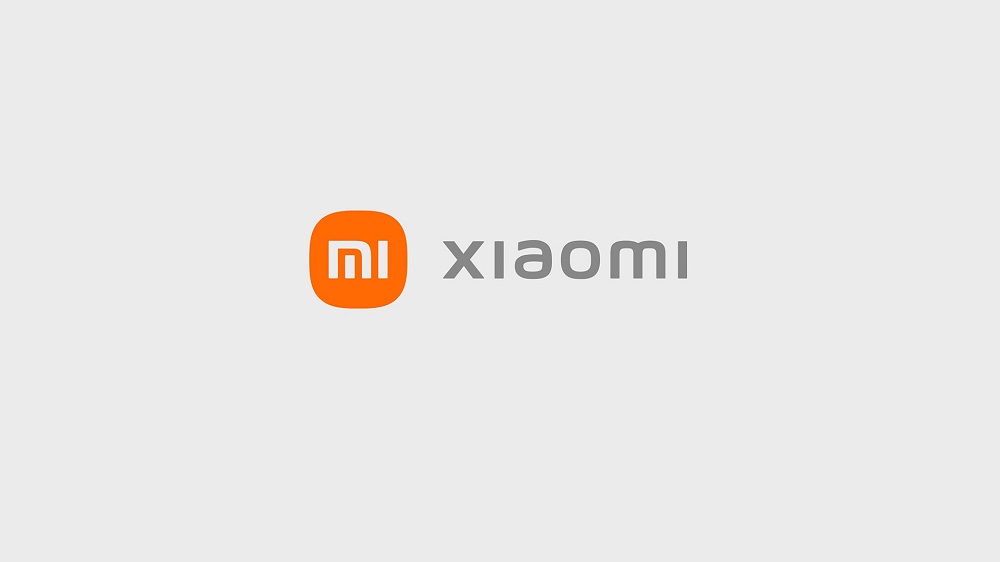
Xiaomi has a new logo which is just a slight adjustment from what they previously had. The company announced the rebrand at its major product launch event held yesterday in China.
Xiaomi’s new logo has a slightly more rounded corner, along with redesigned “MI” typography, which is pretty much everything about the new design.
The existing orange corporate color lives on as it conveys “the liveliness and youthfulness” of the brand.
Xiaomi will use Black and silver as additional colors “to accommodate high-end product line applications.”
Instead of a square, you get a squircle – which is the shape that lies between a square and a circle.
Breaking the news at the product launch event, Xiaomi’s CEO Lei Jun said its new logo is more than just a redesign. He said it also reflects the company’s changes in the whole brand’s inner spirit and mentality.
“This new branding aims to further strengthen Xiaomi’s foothold in the premium market while raising brand awareness with its audiences through its new dynamic logo,” Xiaomi said in a follow-up press release.
“Compared with a right-angled object, a circle is a shape that is more agile, which is the perfect representation of Xiaomi’s flexibility, relentlessness, and will to move forward,” Xiaomi added.
Follow us on Telegram, Twitter, Facebook, or subscribe to our weekly newsletter to ensure you don’t miss out on any future updates. Send tips to info@techtrendske.co.ke


