A New Vertical Layout in Chrome Nudges the Browser Into a Strange Middle Ground Where Habit, Interface, and Attention Collide
Chrome’s quiet rearrangement of its tab layout ends up revealing how much of our online routine depends on design choices we barely notice
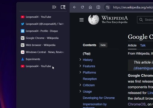
Google’s experiment with vertical tabs in Chrome’s Canary channel looks small at first glance, almost like a UI detour meant for power users. It drops the familiar row of tabs from the top and tucks them into a tall side panel instead. The move creates more space for the address bar and gives the browser a very different posture on a laptop screen. It is the kind of tweak that tends to stir up debates about memory, screen layouts, and whether people even want radical rearrangements of tools they’ve relied on for years. But the test also hints at a broader movement within browsers: a gradual redefinition of how people handle information as web habits multiply.

This isn’t just about a panel. It shows how Chrome has started to examine the structure around tabs, a part of the browser so familiar that most users barely think about it. Once a neat row meant for a handful of sites, tabs have mutated into storage bins for research, waiting rooms for half-finished tasks, and parking lots for ideas people swear they will revisit someday. Vertical tabs attempt to meet that growing sprawl with a layout that feels more like a file tree than a line of tiny rectangles.
A Browser Caught Between Past Conventions and Modern Use
Desktop browsers carry two conflicting inheritances. On one hand, they still borrow from the old desktop-software blueprint: menus along the top, fixed toolbars, and tabs as a horizontal queue. On the other hand, they now serve as full workspaces for people who do everything online. That second reality creates pressure to reinvent navigation. Chrome’s adoption of tab groups was an early acknowledgement that open-tab lists were no longer occasional clutter but a baseline condition of modern browsing.
Vertical tabs may be the natural next step. They create breathing room for dozens of sites without forcing text to disappear into ellipses. They also change the user’s mental map. Instead of glancing upward at a thin strip, the eye travels to a column that functions almost like a document drawer. Some people will find that intuitive. Others will find it intrusive. Interface design often moves in waves like that: one group embraces the new order, another sticks to muscle memory, and the browser tries to support both.

A side note that rarely gets attention: once tabs become a column, they start to resemble operating-system sidebars. This creates room for future integrations, whether or not Google intends to push that boundary. History suggests that browsers experiment with such layouts not just to tidy up design but to create space for features that need breathing room.
The Return of Interface Ambition
Chrome has spent years optimizing performance and stability, sometimes at the expense of visual reinvention. Yet recent updates show a steady return to interface ambition. The addition of memory-use alerts, paired with tab grouping features, hinted that Google was becoming more comfortable adjusting how people move between pages. Vertical tabs extend that line of thought. They put organization front and center, almost inviting people to treat the browser like a lightweight workspace rather than a passive window.

There is an underlying tension here. Browsers still compete fiercely, but the competition has become subtler. Edge already offers a vertical tab layout. So does Firefox through extensions. Chrome’s approach feels less like a reaction and more like an acknowledgment that patterns have shifted in daily browsing. When people run a research marathon, the top bar collapses under pressure. A side panel can stretch, breathe, and list items with full text. That simple design difference can change the tempo of multitasking.
What This Tells Us About Google’s Long Game
Any redesign inside Chrome tends to ripple far beyond the interface. Google has always used the browser as a staging area for its broader computing experiments. That includes the recent arrival of its Gemini tools inside Chrome, which introduces AI-driven help at the browser level. Combine that with the vertical tabs test and you start to see a platform preparing for heavier information flows.
Vertical tabs could work as a companion to AI-powered tab insights. If Chrome starts grouping, surfacing, or reorganizing sessions based on behavior, a side panel gives that activity more room to operate. It also positions Chrome to support hybrid browsing styles where users bounce between personal research, work tasks, and long trails of content. A vertical layout doesn’t solve that complexity outright, but it creates a container that can hold more of it without overwhelming the screen.
Another angle: laptops with taller displays or rotating hinges have become more common. Vertical tabs make more sense on such devices than traditional horizontal strips. Google rarely builds features for a single hardware trend, yet it often tests features that align with slow-building patterns. This appears to be one of them.
Where Vertical Tabs Could Lead Next
If Google decides to push this feature out of the Canary channel, a few follow-on changes feel plausible. Chrome could tie vertical tabs to session management, letting people bundle research trails more fluidly. It could also introduce more granular controls for tab search. The small search icon already present in the panel hints at a browser ready to treat tab lists like data rather than clutter.
Another possibility is a rethinking of new-tab ergonomics. Right now, the new tab button sits at the bottom of the panel in the test build. The placement feels awkward, though not unusual in early experiments. If that button moves or gains more functions, it could reshape how users create and manage browsing bursts.
A less discussed possibility: vertical layouts open the door to peripheral features that currently feel cramped. Think of tools that track reading progress, highlight browsing patterns, or surface related pages. These features often feel squeezed into menus. A broader panel would let Chrome host them with more intention.
The Browser Landscape Is Evolving, Even if Slowly
Browsers tend to change at a crawl because any disruption risks breaking muscle memory. Vertical tabs may test that restraint. The feature isn’t final, and its appearance inside Canary means nothing is promised. But if it moves toward stable release, Chrome’s familiar interface could gain an entirely new rhythm. Some users will embrace it. Others will disable it on day one. The more interesting part lies in what it represents: Google contemplating a future where the browser acts less like a simple window and more like a flexible command center.
That idea has floated around the industry for years, but the actual mechanics have lagged behind. Vertical tabs won’t resolve the deeper question of information overload, yet they introduce a layout that can stretch with the modern web rather than shrink under it.
Chrome’s identity has always rested on speed and simplicity. The next phase may rest on helping people navigate their own habits. Vertical tabs are a small but telling step in that direction.
Go to TECHTRENDSKE.co.ke for more tech and business news from the African continent.
Follow us on WhatsApp, Telegram, Twitter, and Facebook, or subscribe to our weekly newsletter to ensure you don’t miss out on any future updates. Send tips to editorial@techtrendsmedia.co.ke
