Google is Redesigning the News Tab on Desktop Searches

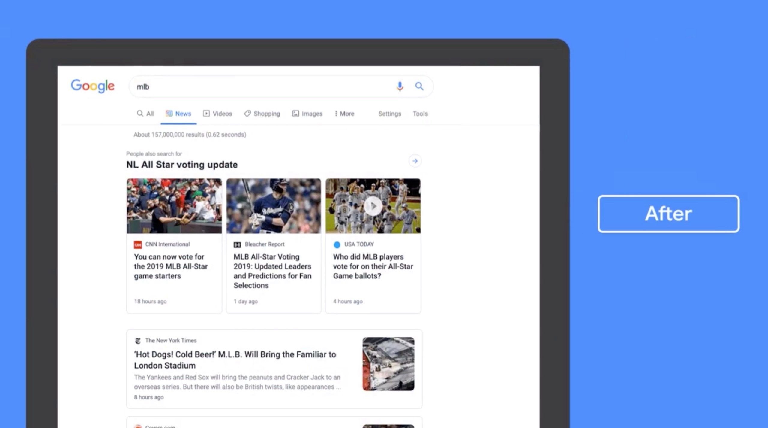
Google has issued a sneak peek on their upcoming update to the News Tab in desktop searches. In a tweet, Google stated the news tab redesign “makes publisher names more prominent and organises articles more clearly to help you find the news you need.”
The redesigned news tab now shows fewer searches related to a particular topic, but the publisher names are more transparent and emphasised. This is different from the old design which news on a specific topic were arranged in a listicle way that did give priority to headlines and not conspicuously revealing the Publisher’s name.
The comprehensive redesign now shows stacked up cards with related topics from different publishers –which resembles the existing Google News main site.
Over the next couple weeks we’re rolling out a redesigned News tab in Search on desktop. The refreshed design makes publisher names more prominent and organizes articles more clearly to help you find the news you need. Check it out ? pic.twitter.com/xa2aZfO4Qd
— Google News Initiative (@GoogleNewsInit) July 11, 2019
JOIN OUR TECHTRENDS NEWSLETTER
It is worth noting that the new layout, as Google states, will help clearly outline related news articles which will make it easier for news enthusiast to circumnavigate around topics they love and discover more.
Although the change is such a minor, it adds up to the general well-being of Google’s News initiative. This is also its part of Google’s plan to curb fake news on its popular search engine. The update is expected to be rolled out to users globally by the few coming weeks.
Follow us on Telegram, Twitter, Facebook or subscribe to our weekly newsletter to ensure you don’t miss out on any future updates.


