Apple Is Using Liquid Glass in iOS 26 to Pull Every App Closer Into Its Design World
Apple’s new design language in iOS 26 feels like a test of how far developers will follow when design becomes a kind of policy.
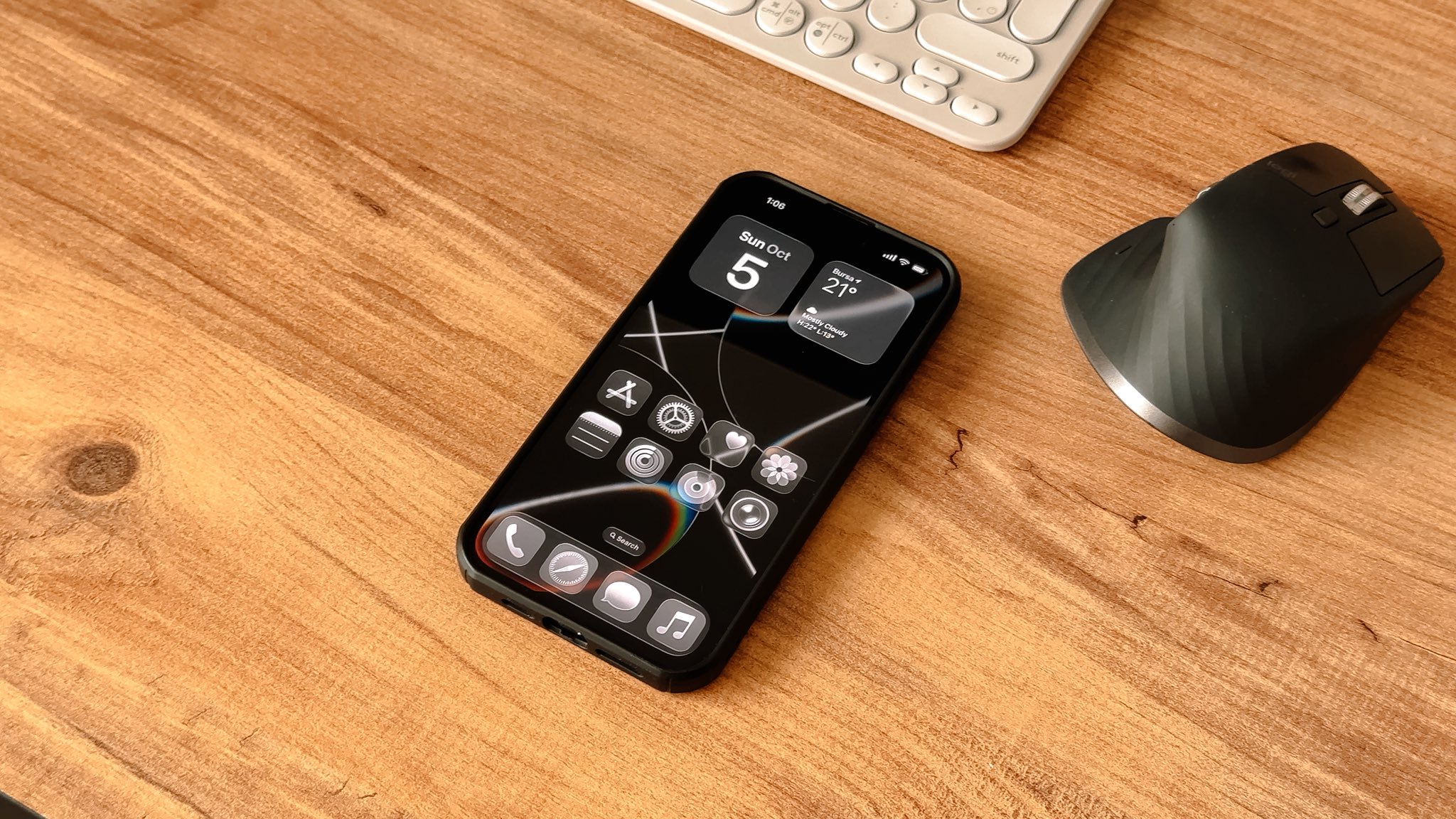
When Apple released iOS 26 in September, most attention centered on Liquid Glass — the new design language that seemed to melt hardware and software into one visual flow. It was glossy, layered, and alive in motion, but what stood out wasn’t only the aesthetic. It was how fast developers began to rebuild their apps to match it.

Barely two months later, Apple published a visual gallery on its Developer site showcasing how apps have adopted the new look. The examples range from big brands like CNN and American Airlines to smaller teams behind tools like Lumy, Crumbl, and Essayist. Each app now bears that same telltale polish: translucent panels, softened lighting, deeper sense of spatial depth. Apple calls this “taking advantage of Liquid Glass to create natural, responsive experiences.” The phrasing is deliberate. It’s both encouragement and expectation.
Design as a message to developers
Apple’s design languages have always carried intent beyond appearance. From skeuomorphism to flat design to the minimalist gloss of Liquid Glass, the company uses aesthetics as a form of discipline. Developers are guided not just to follow a standard, but to align with a visual rhythm that feels distinctly Apple.
Liquid Glass continues that tradition. It’s not a wholesale redesign of the operating system, but a reconditioning of behavior — how buttons respond, how windows float, how light reacts to movement. These are small details that, when repeated across hundreds of thousands of apps, give Apple’s ecosystem its cohesion.
When Apple posts side-by-side comparisons between older iOS 18 interfaces and their new iOS 26 versions, it’s not merely for inspiration. It’s a demonstration of compliance — a public record of who’s keeping up.
From framework to fingerprint
Take Linearity, a vector-graphics app featured in Apple’s gallery. Its redesign now stretches naturally across iPhone, iPad, and Mac, unified by a shared layout and reworked gestures. The iPad version introduces a two-column inspector that resizes fluidly; the iPhone version smooths out thumb interactions. The result feels intuitive, but it also carries Apple’s underlying framework for motion, spacing, and interaction physics.
Crumbl, the cookie delivery app, offers another clue. Its bright pink branding once sat heavy in toolbars. Now, the color seeps through the interface itself, blending with the translucent glass layers. The company didn’t just update its look — it accepted a new way of layering identity within Apple’s template.
These are small examples of how Apple’s design languages operate: part software architecture, part behavioral guide. Each iteration draws developers closer into its gravitational field.
A new kind of consistency
Liquid Glass feels like Apple’s attempt to create consistency without rigidity. The material is adaptive — panels blur and sharpen dynamically, light bends as users scroll — but it’s all bound by an invisible system. Developers can customize, but only within Apple’s grammar.
That subtle balance between freedom and control defines the company’s design legacy. The Human Interface Guidelines, now updated for Liquid Glass, read less like a style manual and more like a philosophical document. It asks developers to “honor depth” and “let content feel suspended in light.” It’s poetic language that doubles as direction.
Why it matters beyond aesthetics
Design language has always been Apple’s softest form of power. When it evolves, it doesn’t just change how things look — it alters how developers think about the medium. By presenting Liquid Glass as a shared canvas rather than a set of rules, Apple makes compliance feel like creativity.
And because these updates are unified across iPhone, iPad, Mac, and even Vision Pro, Apple’s aesthetic cohesion now stretches across every screen it makes. A Crumbl order on an iPhone looks and feels like the same app on a MacBook or in mixed reality. That continuity isn’t an accident; it’s strategy disguised as polish.
Looking ahead
The Liquid Glass rollout shows how Apple uses design to manage both innovation and alignment. It invites developers to adopt new tools while gently setting the boundaries of what “good” looks like inside its world.
For users, this translates into smoother animations, softer edges, and a renewed sense of visual calm. For developers, it’s another reminder that design on Apple platforms isn’t merely aesthetic — it’s structural, almost constitutional.
The company may describe it as an evolution of beauty and responsiveness, but it’s also something else: a reassertion of who sets the visual terms in the Apple ecosystem.
Go to TECHTRENDSKE.co.ke for more tech and business news from the African continent.
Follow us on WhatsApp, Telegram, Twitter, and Facebook, or subscribe to our weekly newsletter to ensure you don’t miss out on any future updates. Send tips to editorial@techtrendsmedia.co.ke