
The classy interface and visual attention of Apple were, for years, a paradigm of UI beauty and harmony. The whole dynamic in the last few years has changed with the arrival of iOS 26 and Android 16 Material 3 Expressive(M3E)style. How surprising it is to see Google setting the standards for a newer design clarity, character, and consistency in spatial logic, where it was always deemed the underdog in UI refinement. Meanwhile, Apple has been floundering amid glassy visuals and underwhelming interactions.

The choice between the Android Material 3 and iOS 26 is no longer just about looks—it is about usability, refinement, and user gratification.
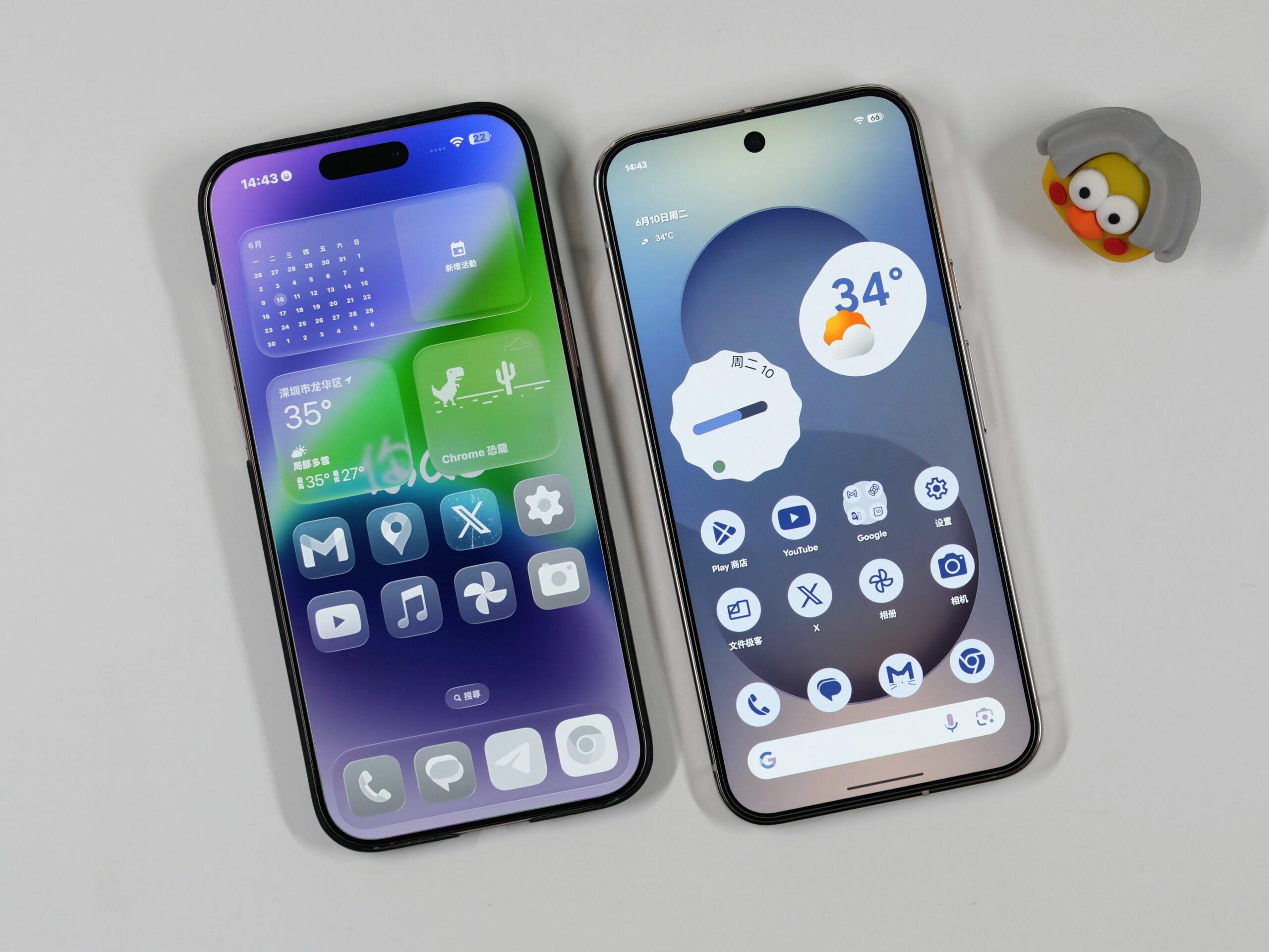
Material 3 Expressive: Depth, Blur, and a Clear Identity
Google’s Material 3 Expressive is more than just a visual update—it’s a commitment to spatial coherence and human-centric design. With this evolution, Android isn’t just pretty; it’s purposefully composed. The heavy background blurs, layered surfaces, and toned-down transparency give Android a mature and grounded feel. Every UI element stands on its own, while contributing to a unified whole.
These aren’t just aesthetic choices. M3E’s design reduces cognitive load. Text is easier to read. Touch targets are clearer. Transitions feel fluid, yet purposeful. Google has struck a balance between flexibility and structure, allowing Android OEMs to customize without devolving into chaos.
The result? Android 16, even in beta, feels more polished than iOS 26’s public release. That’s where the contrast in Android Material 3 vs iOS 26 becomes most visible.
iOS 26: Drowned in Its Own Aesthetic
Apple intended an elegant and futuristic “Liquid Glass” design direction in iOS 26, but the realization felt overwrought. Transparency is applied indiscriminately, creating layered interfaces where sometimes fundamental elements get blurred into illegibility. Notification banners seem to fade into wallpapers while Control Center widgets just hang there in a world of their own. So much of the effect is glorified in screenshots and media demos; in reality, however, it’s quite often a hindrance.
A visual incoherence is jarring for an OS once known for its restrained beauty. Long-term adherents to Apple are decrying it. Reddit threads, conversations on X, and YouTube reviews only paint the picture of a community far less enthusiastic and much more skeptical.
Even worse, it’s not just about what the eyes see. Haptics and gesture interactions, be it all the swipes, scrolls, or even taps, now feel hollow. With very little evolution to be seen in the design mechanics, iOS 26 sells itself through visuals, but when those same visuals contradict usability, it shatters the illusion.
Contrast, Cohesion, and Clarity: Why Google Wins
One of the keystones to think about when contrasting Material 3 Expressive against Apple’s new direction is how the two design philosophies approach contrast. Material 3 Expressive maximizes clearly separated surfaces and keeps blur and depth above transparency to direct attention, giving users immediate clarity.
By contrast, Apple has gone “too far” with translucency. This has translated into form without function, a UI that floats, overlaps, and confuses more than it delights.
And then, there is cohesion. Material You brought color personalization to Android, but M3E makes it feel intentional and mature. On iOS, customizable icons feel like an afterthought, with inconsistent support and jarring transitions between stock and third-party visuals.
Simply put, Google’s UI is designed. Apple’s feels decorated.
Stepping back and putting Android Material 3 up against iOS 26 reveals a deeper split in UX priorities: Android pushes for smart personalization and clarity, while iOS is doubling down on style over substance.
The Bigger Picture: Familiarity vs Innovation
What’s happening here is deeper than one good redesign and one bad one. It’s about who’s willing to reinvent, and who’s clinging to legacy.
Apple is trapped by its ecosystem uniformity. Radical UX change risks disrupting the “it just works” expectation. But in protecting that comfort, iOS has grown stale. Even with the introduction of customizable elements, Apple implements them so cautiously that they fail to spark excitement.
Google, meanwhile, has embraced creative risk. And it’s paying off. Android now feels not only modern but thoughtful.
With Android Material 3 vs iOS 26, we’re watching a generational shift in UI leadership. It’s a comparison that now cuts across aesthetics, usability, and forward-thinking vision.
What Comes Next?
There’s still time for course correction. Apple’s iOS 26.1 or future iOS 27 betas could walk back some of the excesses. Contrast improvements and clearer visual anchors would go a long way. But unless the design direction shifts away from Liquid Glass and toward functionally beautiful simplicity, the trust may continue to erode.
As of today, Android is the better-designed platform.
It’s not just about looks—it’s about how design makes you feel when you use your phone. Google seems to understand that again. Apple needs to remember.
Follow us on WhatsApp, Telegram, Twitter, and Facebook, or subscribe to our weekly newsletter to ensure you don’t miss out on any future updates. Send tips to editorial@techtrendsmedia.co.ke
