YouTube Brings New Changes to Its Video Player Interface

YouTube is changing the interface of its video player.
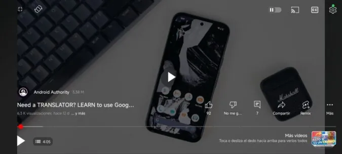
Google, its parent company is testing new features on the video streaming platform and we’ll be seeing a new user interface on its Android app. The company has moved things around including the video title which has been shifted to appear above the progress bar.
The channel name will sit just above the title and show its subscriber numbers next to it. YouTube will also show the view count and the date the video was published below the video title.
YouTube has also pivoted the expand button from the bottom right to the top left. There’s a new rotate button right next to the newly located expand button. The platform has also added the like, dislike, comment, compare, and Shorts buttons above the progress bar on the left side – these icons used to sit below the progress bar on the bottom left. You can even see the number of comments.

YouTue has also removed the forward and backward buttons especially when playing in landscape mode, they, however, reappear when you are watching videos vertically. The bookmark button has been pushed under the menu while the app shows the Remix button by default.
The changes are also visible for the playlist interface as well. The app now allows you to swipe videos to move between them in a playlist.
The new changes make the interface look clustered and a lot of people don’t like this.
YouTube has also started hiding the skip button when playing videos with pre-roll ads. Ironically, the company shared that they don’t want to make the interface dense as the button appears after 5 seconds. However, there’s a new progress bar showing when the ad can be skipped.
Follow us on Telegram, Twitter, and Facebook, or subscribe to our weekly newsletter to ensure you don’t miss out on any future updates. Send tips to editorial@techtrendsmedia.co.ke


