LinkedIn just made a huge redesign to its website, take a look

LinkedIn just made huge redesign to its website. It is calling this complete overhaul of its technology architecture the largest desktop redesign since its inception.
If you have used LinkedIn to look for a job or network with other people, chances are you just filled in your information and never went back. But LinkedIn says this new design is meant to make you stay.
Its goal, the company says is to ensure you can seamlessly access the most relevant professional conversations, content, and opportunities whether you’re on our mobile app or on our desktop experience.
Most importantly, LinkedIn says ‘’this desktop redesign brings conversations and content to the heart of the platform, so you can more easily share ideas, join a discussion, and discover news and topics you care about.’’
So what changes has LinkedIn made to its website?

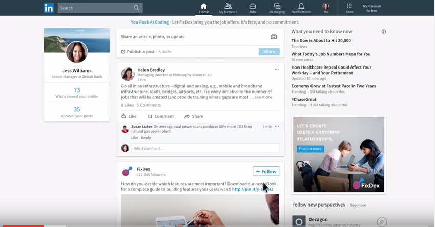
First, the new homepage which takes up the central column has put more emphasis news feeds and encourages users to post more. There is a prominent box at the top page where post a status of a new article. LinkedIn says with a combination of algorithms and human editors working together, it has fine-tuned users need to surface the most relevant content from people and publishers users care most about.
The top left side has been devoted to user’s profiles while the right-hand side is where you get suggestions of people and companies to follow. This side also includes trending news and blogs.
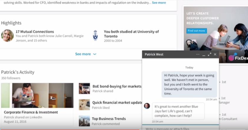
The new updated LinkedIn also features a new messaging feature. The feature has a similar style to what we see on Facebook Messenger. The message windows now pop up at the bottom of the screen, making it easy for people to communicate.
You will also be able to get greater insights on who is viewing your content once you post it on LinkedIn. LinkedIn has made it possible for you to see who’s reading and engaging with the content you share, including the company, job title and even location of people who are interested in your updates.
LinkedIn will also encourage conversations on the website by suggesting people chat with if you have a connection at a company.
‘’These changes put more emphasis on helping you be more productive and stay ahead in your career.’’ The company says.


